Mizô
PT.
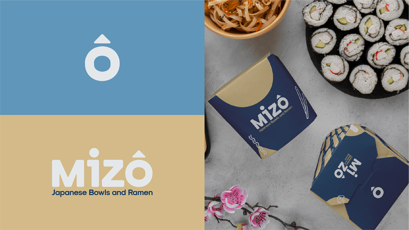
Na criação da Identidade Visual “Mizô” prezamos por trabalhar em uma tipografia que traz sentimentos relacionados ao acolhimento e ao público mais jovem, porém de forma marcante e forte. Por isso, a fonte escolhida possui traços fortes, porém inesquecível. Além disso, trabalhamos o acento no O com o intuito de trazer um diferencial para a marca.
Dessa forma, Mizô é um restaurante tradicional de comida japonesa que se destaca no mercado diante de uma identidade visual única, atendendo ao público jovem que adora conhecer um local diferenciado, mas também aconchegante.
__
EN.
When creating the “Mizô” Visual Identity, we valued working on a typography that brings feelings related to welcoming and the younger public, but in a striking and strong way. Therefore, the chosen font has strong but unforgettable features. Furthermore, we worked on the accent on the O in order to bring a differentiator to the brand.
In this way, Mizô is a traditional Japanese food restaurant that stands out in the market with a unique visual identity, serving a young audience that loves to visit a different, but also cozy, place.